 "TheJWT" (thejwt)
03/27/2014 at 10:49 • Filed to: None
 5
5
 19
19|
"TheJWT" (thejwt)
03/27/2014 at 10:49 • Filed to: None | 5
| 19 |
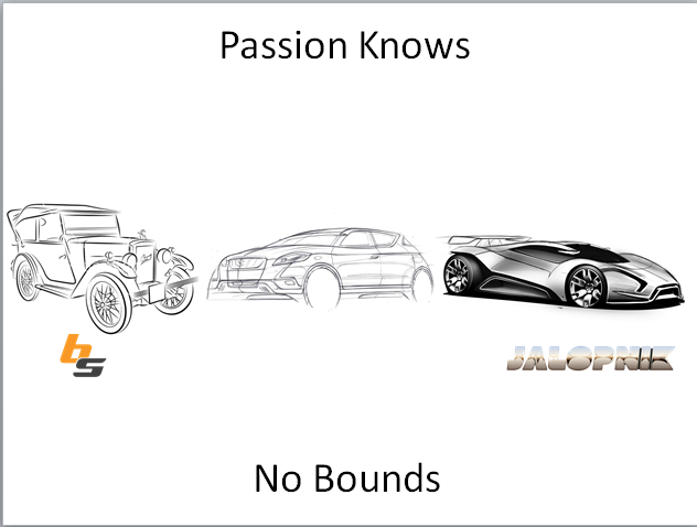
Any graphic design advice? I like how it turned out but any criticism is welcome!
Update-
Thanks for the suggestions! I really like how this looks
 Reigntastic
> TheJWT
Reigntastic
> TheJWT
03/27/2014 at 10:51 |
|
The font kind of sucks, but I like the image overall. I'd probably redesign the logos to be more minimalist as well, since they seem out of place.
 MonkeePuzzle
> TheJWT
MonkeePuzzle
> TheJWT
03/27/2014 at 10:52 |
|
orlove'd
 Otto-the-Croatian-'Whoops my Volvo is a sedan'
> TheJWT
Otto-the-Croatian-'Whoops my Volvo is a sedan'
> TheJWT
03/27/2014 at 10:53 |
|
I like it! I have a few niggles, though... If it were up to me I'd tone down the black on the volvo, or change the color. It's a bit too dark and stands out from the others. Same goes for the yellow, I think it's a bit too yellow, it blends with the background. It might need a touch of red in the color. Other than that, I love it!
|
TheJWT
> Otto-the-Croatian-'Whoops my Volvo is a sedan'
03/27/2014 at 10:54 |
|
Yeah, I wanted the Caprice taxi yellow but it is hard to see. Thanks for the advice!
 BrainForest
> TheJWT
BrainForest
> TheJWT
03/27/2014 at 10:54 |
|
I think the wagon silhouette should be brown. What's the yellow one? (edit - it's Jeff Gordon's taxi, OK)
|
TheJWT
> Reigntastic
03/27/2014 at 10:55 |
|
I wanted to use the font that Blipshift uses on their website, but I can't seem to find it. If I can't find it, what other font do you think would look good?
 RamblinRover Luxury-Yacht
> TheJWT
RamblinRover Luxury-Yacht
> TheJWT
03/27/2014 at 10:56 |
|
The phrase "odd bunch" makes me think that the cars should all be hanging together with stems like bananas. Because I'm insane.
|
TheJWT
> RamblinRover Luxury-Yacht
03/27/2014 at 10:56 |
|
I'm not that good with Photoshop!
 Jagvar
> TheJWT
Jagvar
> TheJWT
03/27/2014 at 11:00 |
|
It needs a Merkur!
 KirkyV
> TheJWT
KirkyV
> TheJWT
03/27/2014 at 11:05 |
|
It needs a small hatchback of some sort - at least, I'd like it to - and I'm not the biggest fan of the look of the Jalopnik and Blipshift logos, but overall I rather like it. My favourite bit's the Orlove'd Beatle.
 RacecaR
> TheJWT
RacecaR
> TheJWT
03/27/2014 at 11:08 |
|
Why isn't the Volvo wagon brown?
 JR1
> TheJWT
JR1
> TheJWT
03/27/2014 at 11:10 |
|
If this is on blipshift I will buy it. Keep us posted. I always forget to check blipshift
|
Reigntastic
> TheJWT
03/27/2014 at 11:10 |
|
That's a couple I like, but you could really use anything that's a bit more simple and less rounded. I'd also probably make it "We're an odd bunch." instead of the ellipsis.
 Yowen - not necessarily not spaghetti and meatballs
> TheJWT
Yowen - not necessarily not spaghetti and meatballs
> TheJWT
03/27/2014 at 11:21 |
|
I think I find it more visually pleasing this way
And as others have mentioned the yellow car is kind of hard to make out.
Otherwise I really like the idea, the other colors work very well together as well, the blipshift logo causes a gulf-like effect.
 quarterlifecrisis
> TheJWT
quarterlifecrisis
> TheJWT
03/27/2014 at 11:23 |
|
I like the theme, but the BS and Jalopnik logos look so terribly out of place.
 JQJ213- Now With An Extra Cylinder!
> TheJWT
JQJ213- Now With An Extra Cylinder!
> TheJWT
03/27/2014 at 11:37 |
|
I like it a lot.. very similar to what I made yesterday in school...
I made it on powerpoint in school so it sucks. But I like the idea
|
RacecaR
> TheJWT
03/27/2014 at 12:04 |
|
The update looks good! But I would space the copy down a little, to kind of match where you had it originally. But that is just my suggestion.
 WhaleTailWant
> TheJWT
WhaleTailWant
> TheJWT
03/27/2014 at 14:18 |
|
Where is Doug's Ferrari on fire?
|
TheJWT
> WhaleTailWant
03/27/2014 at 14:45 |
|
Damn, I knew there was something I forgot